User Interface Settings Dialog
The menu item Settings->Configure User Interface will open up a dialog box in which you can adjust the user interface settings. (Image Settings Dialog covers image settings and TeX Settings Dialog covers TeX/LaTeX related settings.)
Graphics Settings
 |
The Graphics tab (Figure 3.16) allows you to:
- choose between using or not using anti-aliasing to display the graphics;
- choose between speed or quality in the rendering;
- set the colour for the different types of control points;
- choose whether a mouse click on the canvas (outside of any of the control points) exits edit path mode.
![]()
![]() You can also use this tab to choose between enabling (left icon) and
disabling (right icon) hotspots along the bounding boxes. If hotspots
are enabled, you can scale, rotate or shear objects by
dragging the appropriate hotspot. (Note that transforming
composite shapes applies the transformation to the
underlying shape not to the shape as a whole.)
You can also use this tab to choose between enabling (left icon) and
disabling (right icon) hotspots along the bounding boxes. If hotspots
are enabled, you can scale, rotate or shear objects by
dragging the appropriate hotspot. (Note that transforming
composite shapes applies the transformation to the
underlying shape not to the shape as a whole.)
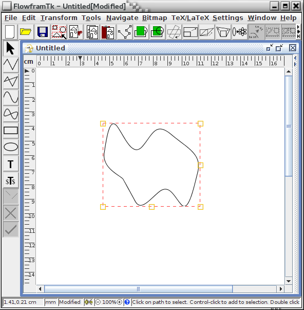
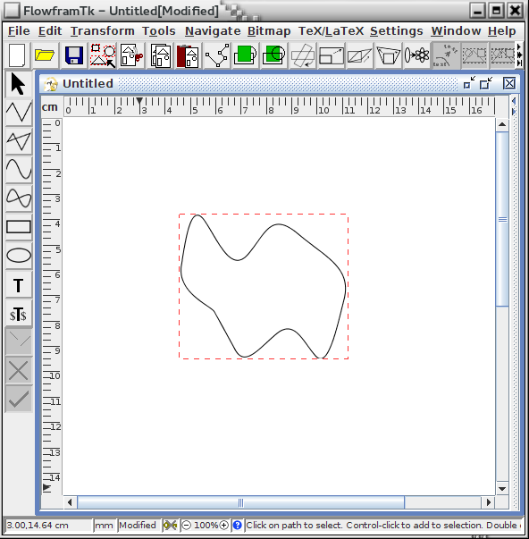
You may want to disable this option when you want to move small objects, or you may end up transforming them instead of moving them. When this option is enabled, the cursor will change shape3.3 when you move it over the edge of the bounding box. Figure 3.17(a) shows how the bounding box is displayed when hotspots are enabled and Figure 3.17(b) shows how the bounding box is displayed when the hotspots have been disabled. Each hotspot is represented by a small square. Available functions are listed in Table 3.3.
| Hotspot | Function | Cursor Appearance |
|---|---|---|
| Bottom left | rotate | hand |
| Bottom centre | scale vertically | South arrow |
| Bottom right | scale both directions | South-East arrow |
| Middle right | scale horizontally | East arrow |
| Top right | shear vertically | North arrow |
| Top left | shear horizontally | West arrow |
Note that even if you have more than one object selected, only the object whose hotspot you are dragging will be transformed. As may be predicted, using hotspots is not as precise as using the transformation dialog boxes described in Selecting and Editing Objects.
|
Annotations Settings
 |
The Annotations tab (Figure 3.18) allows you to set the font used for annotating frames or draft bitmaps and set the font used on the splash screen during startup.
Language Settings
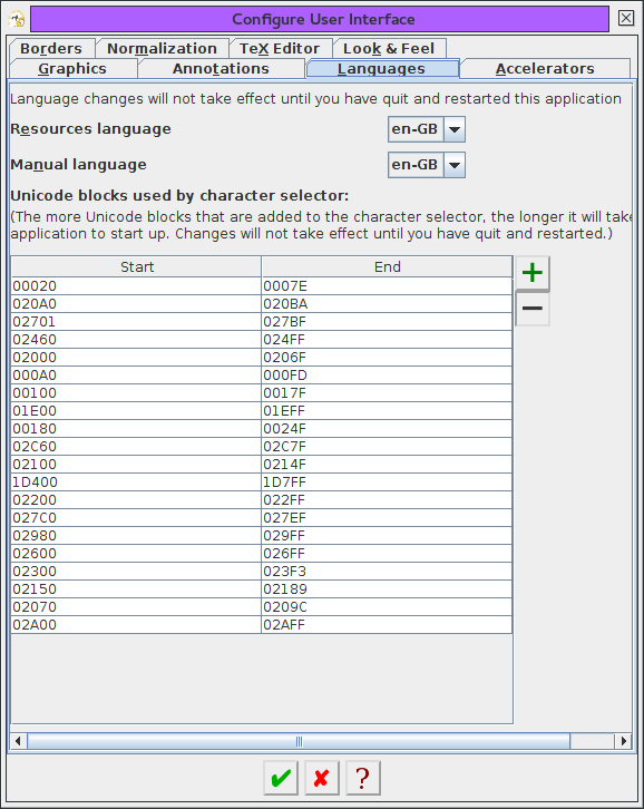 |
You can use the Languages tab (Figure 3.16) to set which language to use for the application resources (menus, messages etc) and which language to use for the manual. These settings will not be applied until you quit and restart FlowframTk. Currently the only available resource languages are: en-GB, en-US and zh, and the only available manual languages are: en-GB and en-US.
You can also use the Languages tab to specify the Unicode blocks to display in the symbol selector. By default, only a limited subsection of Unicode characters are available because it would significantly slow FlowframTk's startup process to provide all possible characters. To add a new block, click on the green plus button next to the table. To remove an unwanted block, select the appropriate row in the table and click on the red minus button. The start and end values don't need to match a complete Unicode block and may span multiple blocks. For example, suppose you regularly want to enter musical symbols into your image, then you can add a block starting from 1D100 and ending at 1D1DD. You need to quit and restart FlowframTk for the changes to take effect. If you want to restore the defaults, quit FlowframTk, open the file flowframtk.conf in the configuration directory and remove the line starting with unicode=
See also:
Accelerator Settings
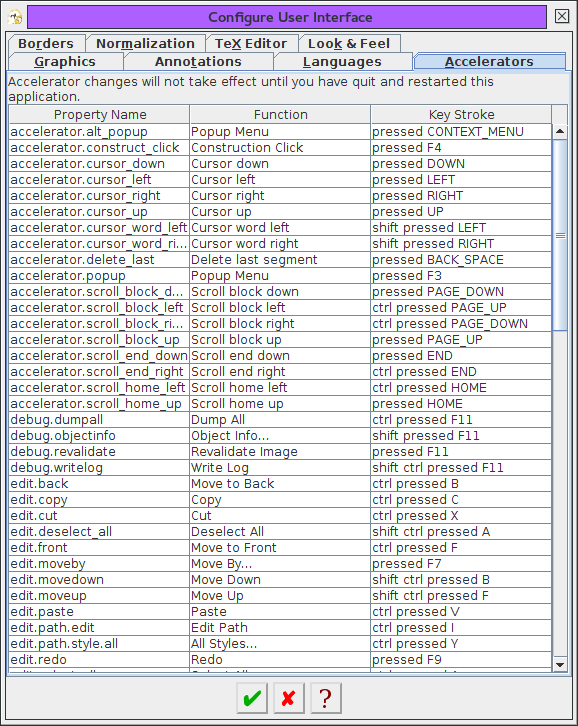 |
You can use the Accelerators tab (Figure 3.20) to change the default accelerators (keyboard shortcuts). It's possible to use the same keystroke for different actions provided the actions are never both enabled at the same time. (For example, F6 selects the next control in path edit mode or adjust the selection in select mode.)
Note: Java's accessibility API uses F10 to switch the focus to the menu bar, so avoid using this key for an accelerator.
Suppose you want to change the accelerator for the Undo function from the default F8 to, say, Ctrl+Shift-U. Find the appropriate row in the accelerator table and double-click on it to open the Set Accelerator dialog box (Figure 3.21).
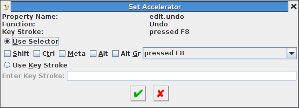 |
There are two ways to change the keystroke. If the Use Selector button is selected, you can select or deselect the required modifiers (such as Shift) and use the drop-down box to select the keystroke. So to change the keystroke to Ctrl+Shift-U, select the Shift and Ctrl checkboxs and set the drop-down box to pressed U. Alternatively, if the Use Key Stroke button is selected you can type the required keystroke in the Enter Key Stroke field. Care must be taken with this option. You need to make sure you release the main key before releasing the modifiers. For example, press down the control, shift and U keys but release the U key before releasing the control and shift keys. Note that the Tab key retains its usual function of moving the focus to the next component in the window, and so can't be typed in the Enter Key Stroke field. (Neither can certain other keys that are always intercepted by the operating system.) The Enter key, on the other hand, will be picked up by the Enter Key Stroke field if it has the focus, so you need to ensure you move the focus to a different component if you want to use Enter to activate the "Okay" button.
The accelerator settings are written to a file called accelerators.prop in the configuration directory when FlowframTk quits normally. You may edit this file using your preferred text editor to change the settings as long as FlowframTk isn't currently running. For example, if you want to change all the keystrokes that require the control key to be pressed to requiring the meta key pressed instead, you may find it easier to do a global search and replace in accelerators.prop of ctrl with meta. If you do edit this file, make sure you only edit the values to the right of the = sign. To restore the default accelerators, delete or rename this file (when FlowframTk isn't running).
Toolbar, Ruler and Status Bar Settings
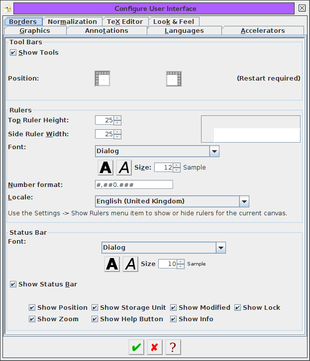 |
You can use the Borders tab (Figure 3.22) to customise the rulers, toolbar and status bar. You can show or hide the toolbars using the Show Tools checkbox. If this check box is selected, you can also specify the location of the vertical toolbar.
![]()
![]() The vertical toolbar is located on the left of FlowframTk's main
window by default, but can be switched to the right by selecting the
Right radio button (or the
right-hand icon shown at the side of this paragraph). You will need to
quit and restart for the change to take effect.
The vertical toolbar is located on the left of FlowframTk's main
window by default, but can be switched to the right by selecting the
Right radio button (or the
right-hand icon shown at the side of this paragraph). You will need to
quit and restart for the change to take effect.
The width (in pixels) of the vertical ruler can be specified in the Side Ruler Width field, and the height (in pixels) of the horizontal ruler can be specified in the Top Ruler Height field. For example, if you find that the y co-ordinates don't fit on the vertical ruler, you can make the ruler wider, say, to 30 pixels. There's a sample panel on the right that shows the dimensions (but doesn't show the ruler annotations).
The way the co-ordinates appear on the rulers is governed by the Number format field. The pattern syntax is as for java.text.DecimalFormat, described in the Java API (http://docs.oracle.com/javase/7/docs/api/java/text/DecimalFormat.html). You can also set the locale governing the pattern, but this pattern is only applied to the rulers, not to the co-ordinate dialog boxes or status bar. The font used by the rulers can also be changed. This panel doesn't provide a setting to show or hide the rulers as this is done for the currently selected canvas using the main menu item Settings->Show Rulers.
You can show or hide the status bar using the Show Status Bar check box. If this box is selected, you can additionally choose to show or hide the individual status bar elements.
See also:
Normalization
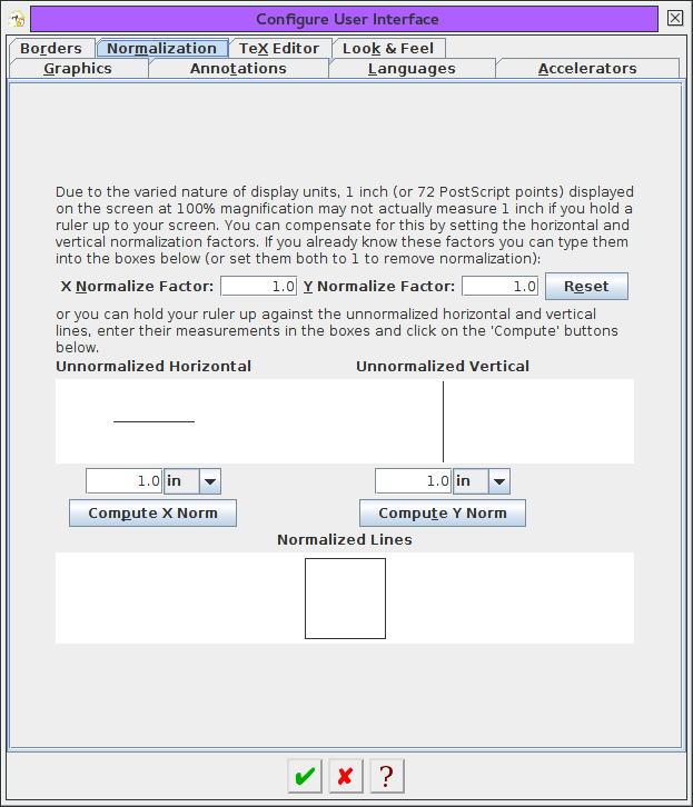 |
When an image is drawn on the canvas via Java's painting methods, the co-ordinates of all the objects are converted into PostScript points (including any scaling applied by the zoom settings). However, it is rare for any display device, such as a standard monitor, to have pixels that are exactly one PostScript point square in size. This means that a 1in (or 72bp) line drawn on the screen at 100% magnification may not actually measure 1in if you hold a ruler up against the screen. This is fairly typical for most graphical applications but, if it bothers you, you can adjust the horizontal and vertical normalization factors used by FlowframTk in the Normalization tab (Figure 3.23).
If you happen to already know the normalization factors for your device, you can enter them in the X Normalize Factor and Y Normalize Factor fields. If you don't know them, FlowframTk can compute them for you. To do this, you need to hold a ruler against the Unnormalized Horizontal line, enter the measurement in the length field below the line and click on the Compute X Norm button. This will insert the normalization factor into the X Normalize Factor field. Next, hold the ruler against the Unnormalized Vertical line, enter the measurement in the length field below that line and click on the Compute Y Norm button. This will insert the normalization factor into the Y Normalize Factor field. You then need to click on the okay button to set these normalization factors.
TeX Editor Settings
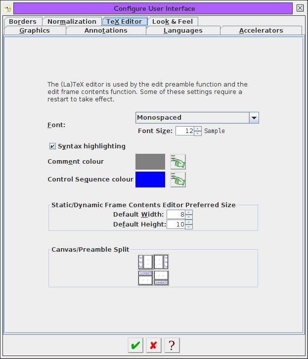 |
FlowframTk has small text editor that's opened when you want to edit the contents of a static or dynamic frame. The font used by this editor can be changed in the TeX Editor tab (Figure 3.24). You can also set the default width (in terms of approximate number of characters per line) and the default height (in terms of lines) for the editor when it's first created at startup. You can also enable or disable syntax highlighting by selecting or deselecting the button marked Syntax highlighting. If selected, you can also set the colour used for comments (indicated by TeX's % comment character) or for commands. The editor currently doesn't have any spell-checking support. The default preamble panel of the TeX/LaTeX Settings dialog also uses these settings.
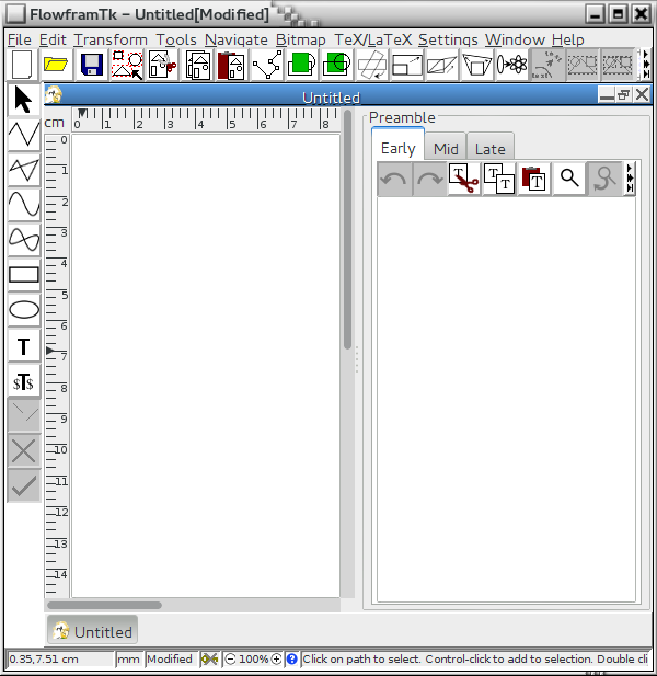
In FlowframTk version 0.7, this editor window was also used for changing the preamble text, but as from version 0.8, the preamble editor has been switched to a pane attached to the canvas that can remain open while you're editing the image. This pane uses these settings, except for the default width and height, which is now governed by the size of the canvas window and the location of the divider. By default, the preamble pane is to the right of the canvas, but you can change this using the radio buttons in the Canvas/Preamble Split area.
Look and Feel Settings
 |
Java displays GUI elements, such as buttons and menus, according to the selected "look and feel". There are a number of different look and feels that may, or may not, be available on your platform. Some of the look and feels don't support certain features such as the click-to-collapse setting on the divider bar in split panes, including the divider between the canvas and the preamble pane. The Look & Feel tab has a drop-down list with the list of available look and feels. For example, Figure 3.25 has the "Metal" look and feel selected. You can change this to a different look and feel, but you must restart FlowframTk for the change to be implemented.
Some example look and feels are shown in Figure 3.26. Note that the main window's title bar and outer border isn't governed by Java's look and feel, but by the operating system's window manager. For example, I've used different window themes whilst taking snapshots of FlowframTk for this manual, which is why the colour and format of the title bar for the main window and for the dialog boxes vary.
|
In addition to changing the look and feel, you can also change how the buttons that have icons are displayed. By default, the buttons with icons have a bordered style, with a different icon image for the up, down, rollover and disabled states, but if you don't like them, you can select a different type from the Style area. Each type has some sample buttons displayed on the right. They don't perform any actions, but you can press them to try them out. The button types come in the following flavours:
- Bordered
- This is the default button type described above.
These buttons have distinctive up and down states regardless of the
look and feel.
- Small Bordered
- Similar to bordered but a smaller version.
- Plain
- This has a single icon image for the button. The up and
down look is dealt with by the look and feel. This means that if the
selected look and feel doesn't draw an up or down effect, you won't
be able to see the button state.
- Small Plain
- Similar to plain but a smaller version.
- Highlights
- This is like plain but there is a
second icon for the down state of radio and check buttons that is
like the up state but has a highlighted background. This means that
you can now see a difference between the up and down states for the
radio and check buttons when used with a look and feel style that
doesn't draw an up or down effect.
- Small Highlights
- Similar to highlights but a smaller version.
- Bordered Switches
- Uses the plain type for press buttons and
the bordered type icons for radio and check buttons. Unlike the
default bordered style, in this case the bordered icons also include
the look and feel's up and down effect (where supported).
- Small Bordered Switches
- Like bordered switches but a smaller version.
Some of these styles also display a textual label, which may be above, below, to the left or to the right of the icon. Alternatively, you can just select the text only option. If you prefer to have a different style for the dialog windows, you can uncheck the As General Button Style button, which will display a set of button styles that you can apply to the dialog windows. For example, Figure 3.27 shows the dialog window from Figure 3.16 with the small icons and trailing text dialog button option.
As with the look and feel setting, you must restart FlowframTk before the changes can be implemented.
Footnotes
- ... shape3.3
- The actual cursor appearance depends on the look and feel of the platform you are using. On some systems the South and North arrows may look the same, and similarly for the East and West arrows.

